
The Future of Responsive Web Design
By John Doe on October 26, 2023

Exploring the evolving landscape of web adaptability.
Responsive web design (RWD) has been a cornerstone of modern web development for over a decade. What started as a revolutionary approach to ensure websites looked good on any device has now become an indispensable standard. In an era where users access content from an ever-growing array of screen sizes—from smartwatches to large-format displays—the principles of RWD are more critical than ever. However, the future of RWD isn't about simply maintaining the status quo; it's about intelligent adaptation, performance optimization, and a deeper understanding of user context.
Beyond Media Queries: Contextual Adaptability
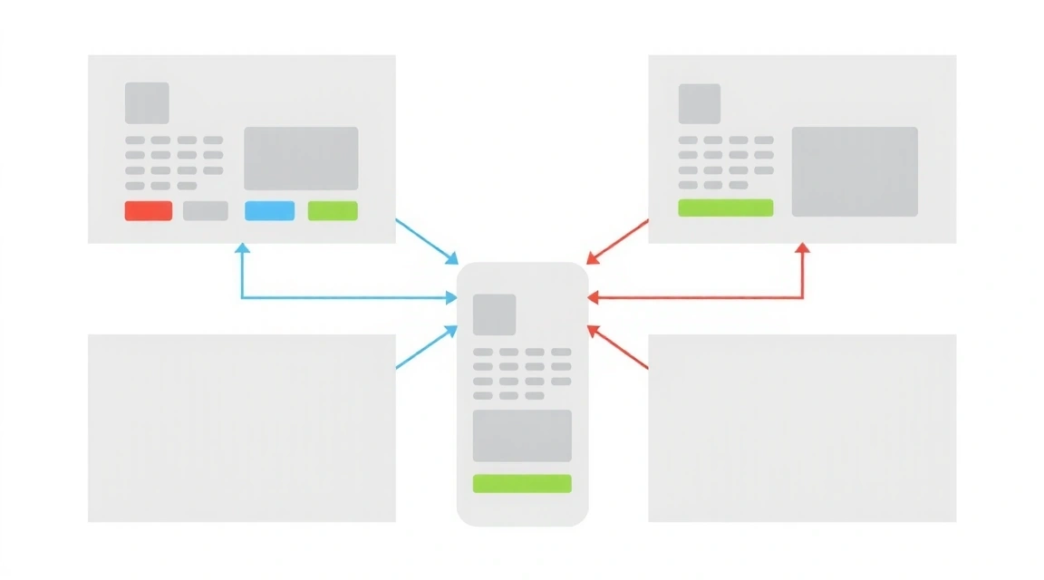
Traditional RWD heavily relies on CSS media queries to apply styles based on viewport dimensions. While effective, this approach can sometimes feel simplistic in a world demanding more nuanced experiences. The future points towards contextual adaptability, where design isn't just responsive to screen size but also to user preferences, network conditions, device capabilities, and even environmental factors like ambient light or user location.
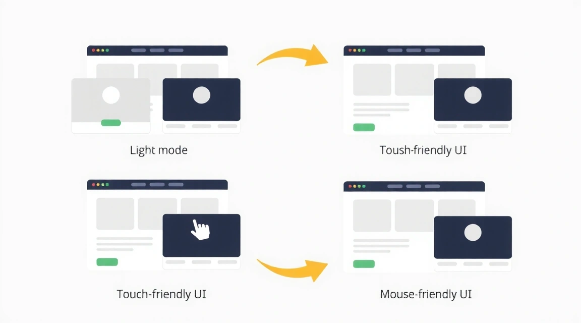
This evolution involves leveraging advanced browser APIs and JavaScript to craft truly personalized experiences. Imagine a website that automatically switches to a low-bandwidth version for users on a mobile network, or adjusts font sizes and color contrasts based on the user's accessibility settings. Container queries, an emerging CSS feature, are poised to be a game-changer here, allowing components to respond to the size of their parent container rather than the entire viewport, enabling more modular and flexible design systems.
Performance as a Pillar of Responsiveness
A responsive design is only truly effective if it's performant. Slow loading times on mobile devices, especially in areas with poor connectivity, can negate all the benefits of a well-adapted layout. The future of RWD places a huge emphasis on performance optimization, integrating techniques like:
- Image Optimization: Using modern formats like WebP or AVIF, responsive images (`srcset`, `sizes`), and lazy loading to deliver the right image at the right size and time.
- Critical CSS & Code Splitting: Delivering only the essential CSS and JavaScript needed for the initial render, deferring the rest.
- Progressive Web Apps (PWAs): Leveraging service workers to provide offline capabilities, fast re-engagement, and app-like experiences.
- Server-Side Rendering (SSR) & Static Site Generation (SSG): Improving initial page load times and SEO by pre-rendering content.
These techniques aren't just about speed; they're about creating a more inclusive web that works for everyone, regardless of their device or network limitations. Performance is not an afterthought; it's an integral part of responsive design.
The Rise of Adaptive Design Systems
As complexity grows, so does the need for robust design systems. Future responsive design will be built upon highly adaptable component libraries. These systems will not only define how elements look but also how they behave across different contexts. This means:
- Atomic Design Principles: Building from smallest components (atoms) to larger structures (molecules, organisms, templates, pages) that are inherently responsive.
- Token-Based Styling: Using design tokens for colors, spacing, typography, etc., allowing for easier theming and adaptation.
- Accessibility by Default: Integrating accessibility considerations into every component from the outset, ensuring that responsive adjustments don't compromise usability for all users.
These adaptive design systems will empower designers and developers to create consistent, scalable, and future-proof web experiences with greater efficiency.
Interactive Element: Responsive Grid Visualizer
To better understand how responsive layouts work, we've included a simple interactive grid visualizer. Use the slider below to change the simulated screen width and observe how the grid columns adapt.
Content area (simulated width)
Conclusion: A More Intelligent Web
The future of responsive web design is one of increased intelligence, user-centricity, and performance. It moves beyond simple layout adjustments to encompass a holistic approach to adapting experiences based on a rich tapestry of contextual data. By embracing advanced CSS features, robust design systems, and a performance-first mindset, developers and designers can continue to craft web experiences that are not just visually appealing but also universally accessible, highly performant, and truly delightful for every user, on every device.
Related Posts

The Latest UI/UX Trends for 2024
Discover what's new in user interface and user experience design.

Mastering SEO: A Guide for Web Developers
Essential SEO techniques every developer should know for better visibility.

Top 5 Web Development Tools You Need
Boost your productivity with these indispensable development tools.